Not a mood board. Not a logo file. A standards-grade specification, built the same way for every client — only the depth changes.
An Omega Document is not a mood board and not a logo file. It's a standards-grade specification — every section exists so that anyone, with no access to the original designer, could reproduce the brand exactly: the right ink, the right rotation, the right typeface at the right weight, on the right surface. The tier a client buys determines how many of these sections are built out, and to what depth — not whether the document exists at all.
This is the actual Groove Inc Omega Document — the Ground Zero-era original, still governing this site. Each highlighted area is numbered to match one of the eight sections.
PAGE 1 OF 2
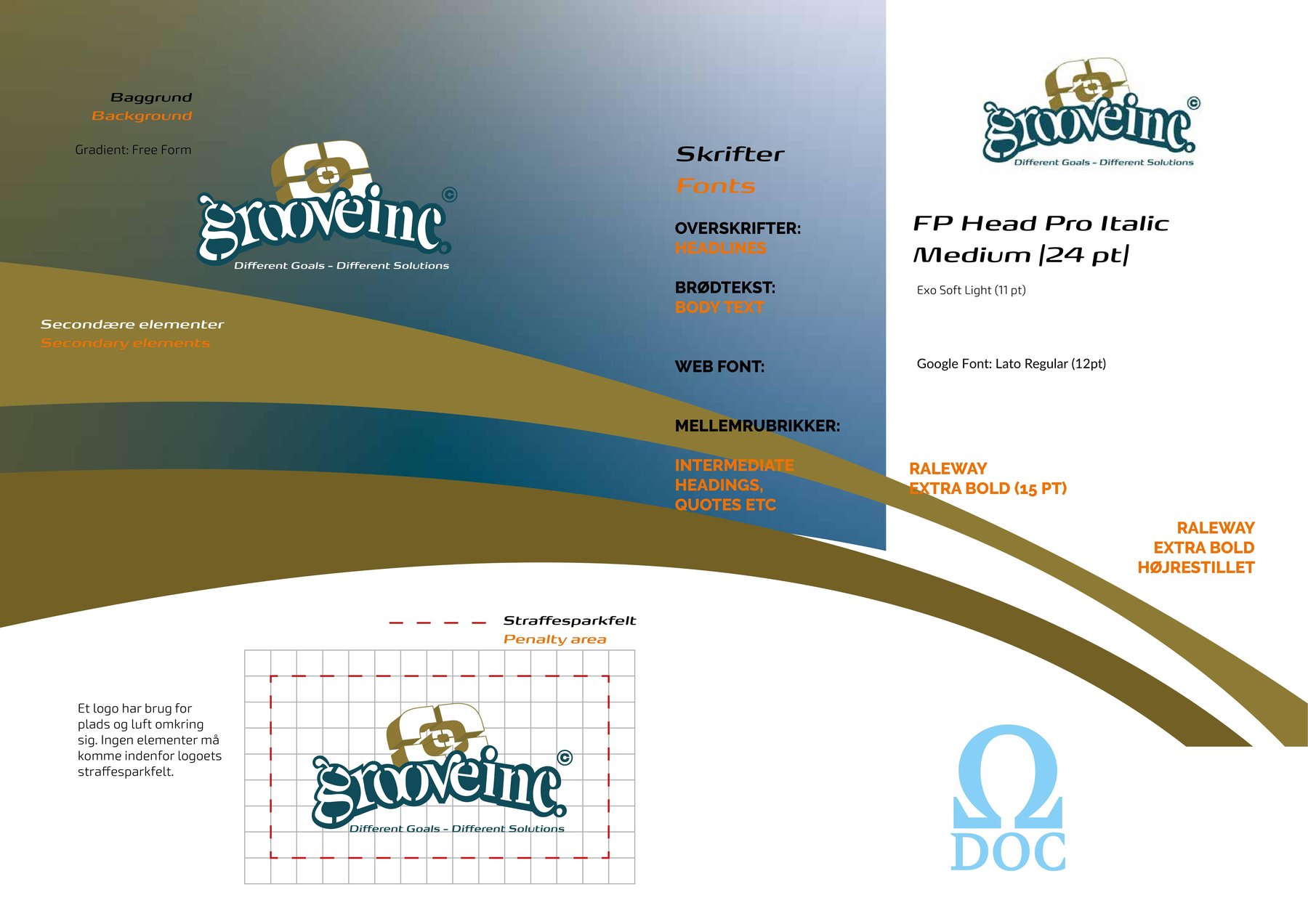
The free-form gradient recipe — primary blue through primary gold to white — shown as a repeatable swatch, not a one-off.
All four roles named side by side: Headlines, Body text, Web font and Intermediate headings/quotes, each with its real typeface and point size.
The measured grid defining the minimum air around the logo — nothing is allowed to enter it, on any surface.
PAGE 2 OF 2
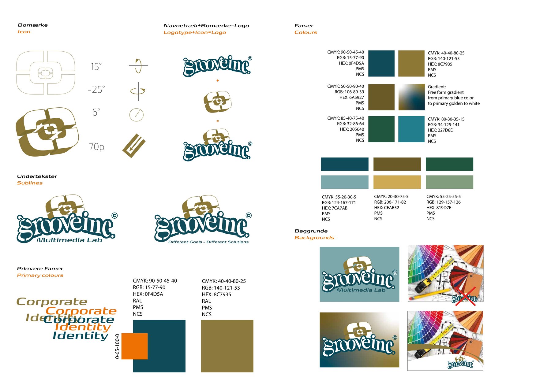
The literal build geometry — 15°, -25°, 6° rotations and a defined stroke width — so the icon can be reconstructed, not just re-exported.
The assembly, shown as an equation: icon plus wordmark equals the one approved lockup.
Two real variants — "Multimedia Lab" and "Different Goals — Different Solutions" — the modular tagline slots the logo can carry.
Blue and gold specified in every system needed to reproduce them, plus a live demonstration of both in running text.
Three secondary colours and three muted tints, each carried in the same multi-system format as the primaries.
Correct placement on a solid brand colour, and — crossed out in red — the busy photographic background the logo must never sit on.
The short version of everything above — what changes by tier is which sections are included and how deep each one goes.
The base visual field the brand sits on — for Groove Inc, a free-form gradient running from primary blue through primary gold to white. Specified as a named, repeatable recipe, not "whatever looked good."
Four roles, named explicitly: Headlines (Groove Inc: FP Head Pro Italic Medium, 24pt), Body text (Exo Soft Light, 11pt), Web font — a separate, explicit substitution for screen use (Lato Regular, 12pt), and Intermediate headings/quotes (Raleway Extra Bold, 15pt, with a documented right-aligned variant).
The mark's build geometry — literal rotation angles and proportions (Groove Inc's icon: 15°, -25°, 6°, and a defined stroke width) — so the icon can be reconstructed without redrawing it from scratch or guessing at an existing export.
How the wordmark and the icon combine into the single approved lockup — documented as an assembly, not just a flattened final file.
The modular tagline slots the logo can carry depending on context — Groove Inc's logo pairs with either "Multimedia Lab" or "Different Goals — Different Solutions" depending on where it's used.
The one or two colours that carry the most brand weight, specified in every system needed to reproduce them: CMYK, RGB, Hex, and slots for RAL/PMS/NCS once confirmed. Groove Inc's primary blue (#0F4D5A) and primary gold (#8C7935) sit here.
The secondary and muted/tertiary palette. This is the section that scales most visibly by tier: a small brand might stop at primary + one secondary; a full system needs the whole palette specified before it's usable across print, web and physical material.
The rules for where the logo is and isn't allowed to sit — including a measured clear-space grid ("penalty area") defining the minimum air around the mark that no other element may enter. This is what stops a brand degrading the first time someone else touches the file.
| Tier | Sections included | Real proof point |
|---|---|---|
| Omega Essentials | 3 (Icon construction · Logo lockup · Primary colours) + basic type hierarchy | Yo Yah ("Docmini") — no physical-environment work, no full colour system. |
| Omega Complete | All 8, in full — every colour in CMYK/RGB/Hex/Pantone/NCS, sub-brand lockups, photography/content direction added on top | Groove Inc's own brand, Duck n Fries — deliberately without certification/badge work. |
| Omega Environment | All 8 from Complete, plus Sections 7/8 extended into physical space — every colour re-specified against the standard that governs that surface | Hindsholm Gårdbutik, interior + exterior. |
| Brand Architecture | The full document, repeated and cross-referenced across multiple related entities under one parent | Stålbæk Holding — four entities, one governing system. |
| Sustainability Cert. Branding | A ninth section, deliberately not part of the base eight — built once YFP has evaluated the client | Your Footprint itself. |
Even at Environment tier, sustainability certification branding is a separate, YFP-attributed add-on, priced and scoped on its own. This keeps the core claim — "I specify your brand" — true regardless of whether a client wants or qualifies for the YFP layer.
Essentials and Complete are print/screen documents. The jump to Environment is the jump from "your brand, correctly reproduced" to "your brand, correctly reproduced on your actual shopfront."